SEO
/ Overview
Sager Creek Vegetable Company, formerly Allen Canning Company, carries a long
history, thus brand recognition for the consumer in the retail store experience. It is a leading
“southern style food” brand in the southeast. Allens, an iconic name in Arkansas’ business history,
changed its name in July 2014 to Sager Creek Vegetable Company as part of new ownership and management
changes.
Sager Creek Vegetable Company currently sells through retail stores. At the time of
this review, the site was, in essence, an eCommerce function even though there is additional information
to involve the public like recipes. The current website under the Sager Creek Vegetable Company is a
huge improvement over the site under the Allens Canning Company name. It is unknown whether online sales
through an ecommerce function will return to Sager Creek's business model.
The main target for its online sales is the Southeastern US, which includes: West
Virginia; Virginia; North Carolina; South Carolina; Georgia; Florida; Alabama; Tennessee; Kentucky;
Mississippi; Louisiana; and Arkansas. Individuals living in the West spent the least on canned
vegetables, while individuals in the South spent the most in both 2004 and 2008.
The target online shopper leads a busy life and expects a quick purchase experience.
For the product line, small to large families are especially targeted for cost per unit and convenience
of use. This benefits the food preparer who may hold more than one part-time job or who has returned to
school. With the increase in business-to-consumer e-commerce revenue topping nearly $200 billion in the
United States in 2012 and anticipated growth, Sager Creek Vegetable Company is in a position to capture
sales in the 20-40 year old shopper, particularly in the Southeastern United States.
/ Process
In order to generate possible keywords, various words directly pertaining to
Sager Creek Vegetable Company’s products were tested using online keyword suggesting tools. The goal
was to broaden ideas and also look for patterns where long-tail keywords could be generated. The
goal was to find long-tail keywords that were not too specific; yet, would be specific to the
business with lower search volumes and competition. These search phrases were then researched in
Google AdWords to determine monthly queries and suggested bids for a CPC, or cost per click,
campaign.
From the numerous tests, a list of ten top keyword phrases emerged. These were
distributed among competitive ad placement ranking from low to medium to high. As expected, generic
terms like canned beans and canned vegetables fall in a medium competition range. The brand Del
Monte already maintains a large market share and this is prevalent in the current ads for these
terms. The popularity of canned green beans in the American diet and, in particular, during the
holiday season make this search word of no value to Sager Creek Vegetable Company. The same holds
true for canned corn. In an interesting direction, searching for survival foods returns a high
competitive ranking; yet, no current ads were returned. This opens a unique direction that would
need to be delicately developed on the Sager Creek Vegetable Company home page in order to pursue
this for keyword optimization.
/ Recommendations
Sager Creek Vegetable Company provides the consumer with a brand choice for canned
vegetables in a market that is saturated by Del Monte, Green Giant and Libby’s. The strength of Sager
Creek Vegetable Company is its niche offering of regional favorites such as field peas, okra and turnip
greens. Only Glory Foods enters that market, but is seen more of a soul food brand due to the way they
have capitalized on the company’s African American ownership. Their foods also tend to be seasoned and
sold as replacements for in-home preparation. Basing keyword choices for a Pay-Per-Click campaign on
this, it is highly suggested the phrases “field peas,” “southern recipes,” “black eyed pea,” and “hoppin
john” be used. Caution must be given to “black eye pea” where making the word “pea” plural creates hits
for the popular music group.
The suggested phrases are long-tail to provide a specific and measurable search while
also not too specific like, “deep south field peas with snaps,” that Google AdWords does not have enough
data to measure. These suggested phrases should be used for a PPC text campaign as sponsored ads in
search engine query results. Cans of the pertaining product should be shown with a call to action and
link to the store’s web page. While the individual vegetable will have direct conversions, a phrase like
“southern recipes” gives the consumer a resource for ingredients commonly used in the recipe. Cross
marketing with social media like Facebook and Twitter should be incorporated to coincide with the use of
these links on the company landing page and throughout the site.
Wireframe
/ Process
It should be first noted and emphasized that the primary business model of Sager
Creek Vegetable Company is to offer its products in traditional brick-and-mortar grocery stores. That
said, an online store presence was offered at the time of this review to allow consumers to buy any of
the products from all of the product brands in bulk.
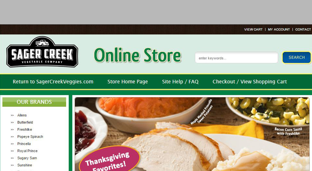
On first review of the store home page it was easy to discern that it was a template.
A notation in the footer exists crediting the site as, “Built with Volusion.” Volusion is a very popular
all-in-one ecommerce software solution for selling online that offers templates as part of the many
benefits of the product. Templates benefit the client because there is no coding involved so companies
can focus on their primary business of canning instead of design and site maintenance. Templates are
functional, but can feel generic and quickly become outdated.
To begin the wireframes for the redesign I reviewed the store layout as it applied to
products, search functions, presentation of information and usability. I found I could keep the same
main navigation links. The terms were explanatory and reached relevant information. The wireframe footer
is a placeholder for information the company and designer feel is pertinent, such as additional FAQ
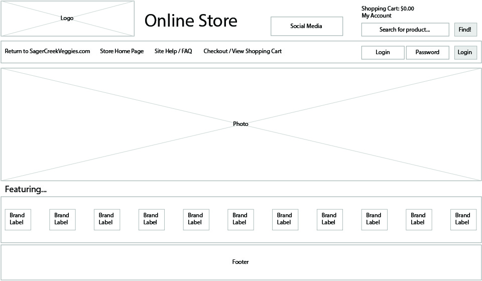
links and newsletter signup. The body of the home page is restructured to let imagery tell the story
instead of text. In any graphic or web design, the viewer will first see color, shapes, images, words,
and context in this order. Imagery appeals to a user’s senses so this becomes the rationale./p>
/ Recommendations
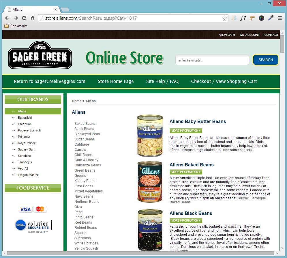
I removed the sidebar navigation links to brands to make full use of the width of the
viewport to show more of a product or its use, or line of products in a brand. The brands are important,
as is brand recognition. Instead of plain text for a brand listing, the brand as it appears on the
product is used below the main image. The user will recognize the shape and color of a brand label and
this also provides a visual cue if the product line is offered to the user at their local grocery store.
This sells the brand and provides an important touchpoint.
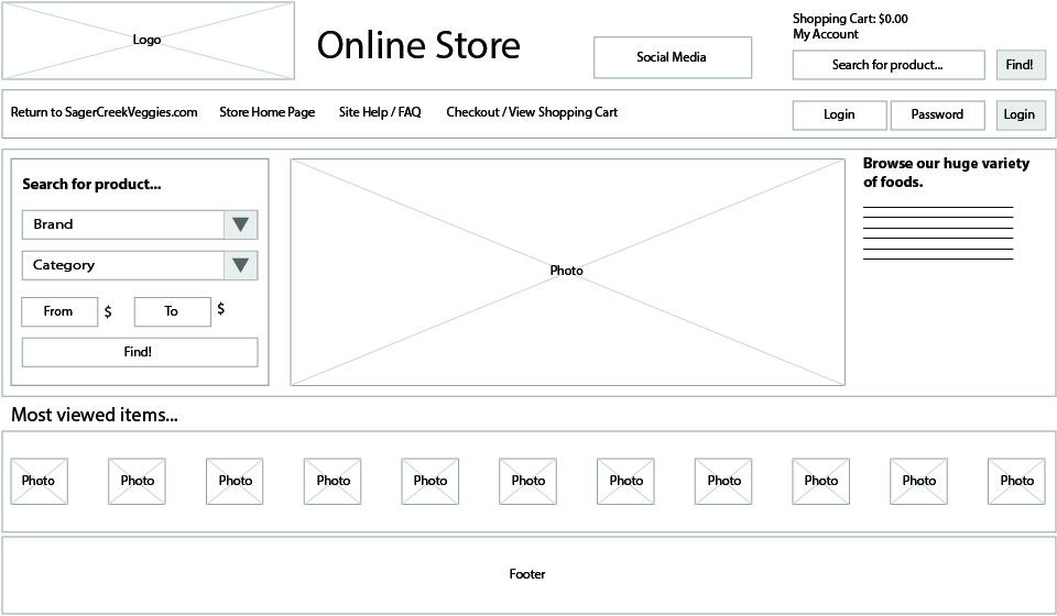
The brand clicked on the store home page is used to determine the image shown. To its
right, there is a headline with description for marketing. Below these are images of products to be
highlighted. This acts as a “suggested sell” feature and can be changed based on current marketing
campaigns. A search feature is sorely missing from the current site. To the left of the main image, a
search box is added. It is robust by allowing the user to select by brand, price, and product. The
latter is needed because there is some overlap of products. For example, black beans are offered under
the Allens brand and the Trappey’s brand. The interface remains simple and appears during the shopping
experience so the user knows where to go on any page to find a product. This insures a positive user
experience. Once the user clicks on a “most viewed item” image or creates a query, they are taken to the
cart.
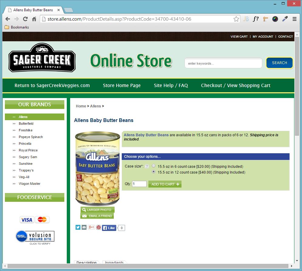
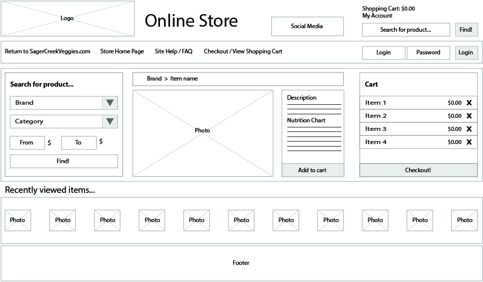
The cart page keeps the search form and becomes the basis for presenting the user
with items. The resulting selected product appears next to the search feature with an image for user
recognition. The title above the image shows the brand and product name so that the user can be certain
of their choice. Within close proximity, the user can read a description and get nutritional
information. This is also where the user can add the product to the cart.
The cart module is displayed in the same row as the search and results modules. Here,
the user can see everything in their cart at a glance, pricing and an option to remove the product. On
the current site, a modal window opens briefly on top of the item selection screen, but disappears. It
can be revealed to the user by highlighting on the top level navigation link “Checkout/View Shopping
Cart” but this requires the user to explore the page. It is not intuitive. In the redesign, the user is
aware of all information at all times. More products can be queried and the resulting display will
update the image and description. This requires fewer clicks than the current site, where a user must
use the sidebar navigation or breadcrumb trail to get to another product line. This becomes confusing
and overloads the user with information and choices. Once shopping is complete, clicking on the Checkout
buttons brings the user to the cart itemization screen.
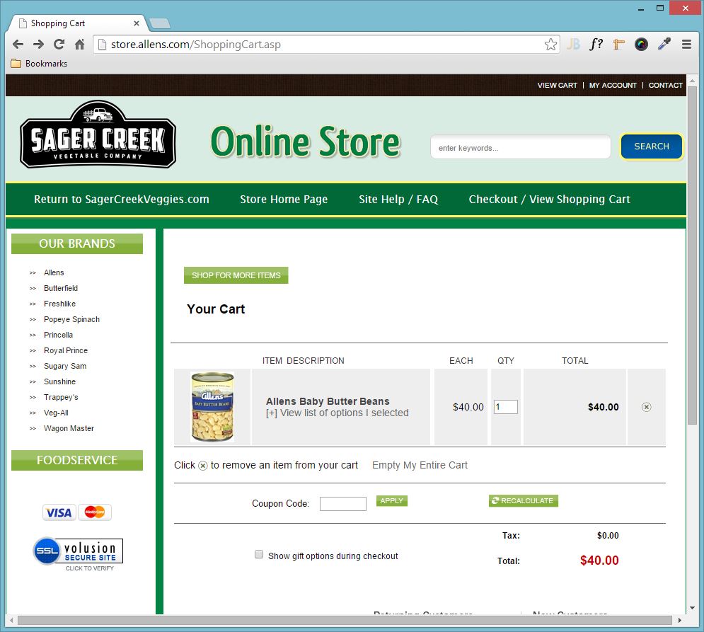
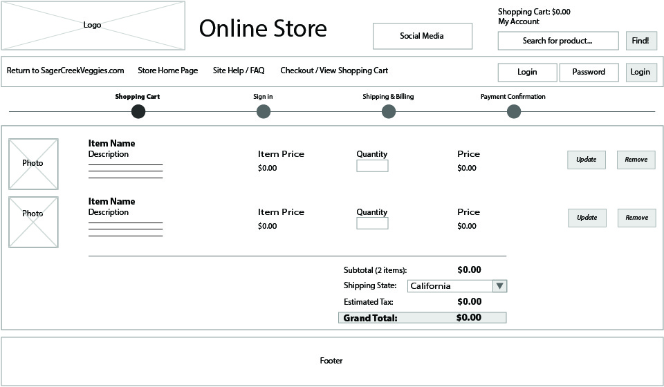
On the itemization screen, the user sees all products in the cart. An image provides
a visual cue along with the name and brief description. The quantity can easily be changed or the item
can be completely removed. This page also begins computing the estimated final total dependent on tax
rate. This rate is finalized once the user provides a shipping address. The checkout process begins here
and a progress bar appears at the top so the user knows what to expect. The next few screens are simply
information gathering forms; thus, they are not shown in the wireframes.
The site and process redesign focuses on imagery and brand recognition. The shopping
experience limits the screens the user must currently click through. The interface is clean and simple
with modules using the design principle of proximity to show relevance to its function. The user can
trust the process, because they can see all of the information in one screen. Overall, this redesign is
a modern and much more streamlined experience for the online shopper.